

This is part one of a three-part series on fundamental design concepts and best practices for content, social media, and SEO marketers.
How Design Impacts Engagement and the Success of Marketing Campaigns
Most people don’t read online content; they skim it. But there are things you can do to make a reader stop and take notice, like using the right images and color, or even displaying text in a striking font. This is why digital marketers are placing a greater importance on design and design elements. In a survey of 177 senior marketing leaders, the Chief Marketing Officer (CMO) Council found that 65% believed that visual assets such as photos, videos, and illustrations were key to the marketing of their brand story.
Having a weak or unappealing design could cause our content to be totally skipped and lost in the feed — Joseph Kalinowski, Creative Director, Content Marketing Institute
There is also the constant need for fresh, new content. The amount of content we consume is staggering. Americans spend an estimated average of 8.5 hours a day consuming traditional and digital media. Daily internet media consumption is expected to reach nearly 30% in 2017. Instagram (an inherently visual content platform), with around 77.6 million users in 2015, is expected to grow 15.1% this year. Creating more engaging content is a top priority of 73% of B2C marketers; they are also allocating more of their budget towards content marketing
Often times the responsibilities of content creation and planning falls on marketers themselves, which is why it helps to have some basic understanding of the principles behind good design. Even if you have a content team that can produce assets, it still helps to have an understanding of what makes for good design and some best practices of the design process in order to better communicate what you want. (In other words, find better ways to provide feedback to designers other than “Take it to the next level” or “Make it pop.”)
Four C.R.A.P Principles of Good Design
In her classic book on design, The Non-Designer's Handbook, Robin Williams explains how good design is comprised of four basic principles:
Contrast
Repetition
Alignment
Proximity
C.R.A.P. Easy to remember. Hard to say with a straight face. Now, some more about those four principles.
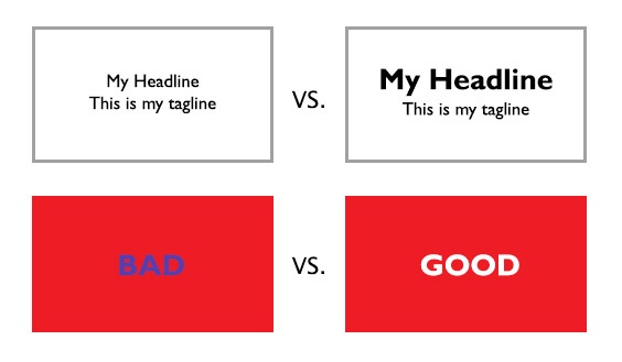
Contrast
Contrast helps to direct the reader’s eye to what’s most important (what they should be looking first), and what they should be looking at next. Most often this is done with size and color, as you can see in the examples below.
Repetition
The repetition of elements (such as color, shapes, lines, text, and fonts) can strengthen a creative by reinforcing a message or unifying a look.
Alignment
Alignment provides structure and order to your creative. When the creative elements on a page are well aligned, it appears polished, sophisticated, and professional. Poor alignment results in something that looks sloppy, boring or unfinished.
Center alignment is popular because it’s an easy way to achieve a symmetrical and formal look, but it can also come across as safe and boring. Center alignment is best used for headlines and short lines of text.
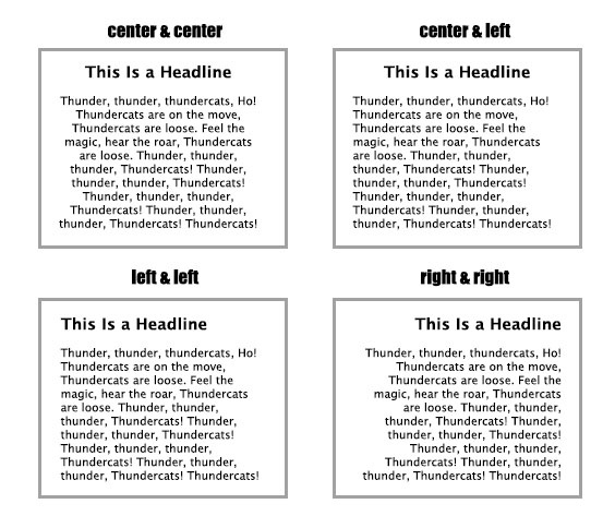
Flush left produces a hard, left-hand margin line. It can give off a more strong, secure look, and is the most popular choice for large paragraphs of text. Flush right also produces a hard line, but it has a slightly unconventional feel.
The general rule is to avoid using more than one text alignment in a creative.
Proximity
The proximity principle refers to the grouping of related items, which allows the audience to better understand the information being presented.
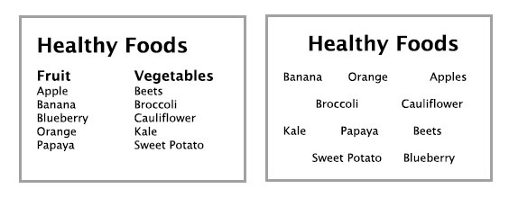
Grouping unrelated items together is confusing to readers, and they may overlook vital information.
Color, Type, & White Space
Color
Color can have a powerful effect on a person. It can arouse an emotion, evoke memory or association, or compel a reader to perform an action. Understanding which colors work best for you project and how to apply them may seem like a daunting task at first, but there are some ways to help you become more comfortable working with color:
- Discover color relationships. Different color combinations can produce different moods and effects. Lifehacker has a good tutorial on basic color theory.
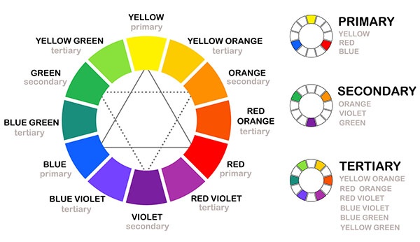
- Learn the meanings of colors. Warm colors such as red and orange are associated with passion and energy, and can stimulate appetite. Dark blues come across as safe and trustworthy, which is why many financial institutions incorporate this shade in their branding. Keep in mind that these meanings can change from person to person, and especially between cultures. For more information, read Smashing Magazine’s Meaning of Color.
- Start working with a color that appeals to you. Sometimes the best thing to do is stop thinking, and just start with what appeals with you most. Allow yourself to play and experiment, and don't worry if your first efforts are less than perfect.
- Explore color palettes. Awwwards has several examples of trendy color palettes and how they were used in creatives.
- Create your own color palette. Paletton is a wonderful tool that allows you to create a huge range of (monochromatic, adjacent, adjacent plus complementary, triad, and so on) based on any color of your choosing.
Remember that color should add to the overall design, not be a design crutch. In other words, don’t rely on bright, screaming colors to make your creative more exciting if it has nothing to do with your brand identity and message. It may ruin the design and turn off your audience.
Also, some companies have strict branding guidelines when it comes to design. You may have no choice than to work with a predetermined color palette.
Type
Typeface selection is another subject that can seem quite intimidating to design novices. Some prefer to play it safe, sticking with the tried-and-true Helvetica or Arial, but most of us would prefer something more, uh, creative. Here are some resources and best practices:
- Read up on typography. Smashing Magazine and Canva both provide great, practical overviews on how to begin working with typefaces. If you really want to immerse yourself in subject, I recommend starting with Thinking with Type by Ellen Lupton.
- Limit the number of fonts. The general rule is to try and stick to two. You don’t want your creative to look like a ransom note.
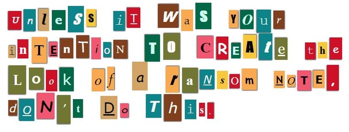 Courtesy of The Ransomizer.
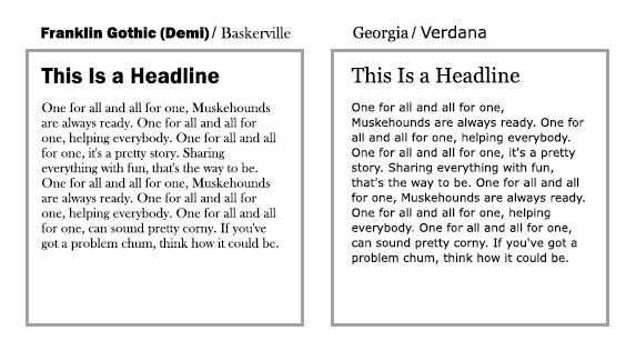
- Choose contrasting fonts. When working with font pairings, make sure that the two styles are distinct, yet complement each other. A popular combination is combining a sans-serif typeface with a serif one. Designers will commonly choose a bold or “statement” style of typeface for use in headlines and headers and a simple, classic, readable font for the body copy. For more on combining fonts, read Best Practices of Combining Typefaces.
- Explore font pairings. Creative Bloq and Just Creative have some great pairings.
- Web safe fonts. Depending on the what you're working on, you may need to stick with web-safe fonts. Web-safe fonts can be viewed across most browers.
White Space
When we see an empty space in a creative, we often have the impulse to fill it with something. However, it's important to realize that white space (though not always literally white, depending on your design's background color) has a big impact on how a reader engages with your creative.
A cluttered design is hard to scan, and too much information will overwhelm the reader, causing him or her to tune out. (Picture the visual cacophony of Times Square billboards.)
Some tips on using white space in your visuals:
- Give your elements room to breathe. Are your lines of text too close together? Or perhaps the image is too close to the block of text. Add the appropriate amount of padding so that your elements look bunched up.
- Don't go overboard. You still need to grab a reader's attention in order to communicate your message. Remember the rule of contrast to make important elements stand out and the rule of proximity to add order and meaning to individual elements.
Next in the series: How to plan and execute a design concept.
COMMENTS